With last week's release of our software we added a new enhancement you can include on your donation page.
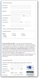
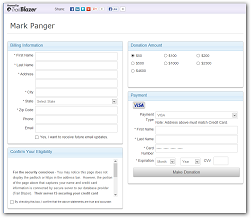
Our legacy donation iframe looked like the left side picture (click to enlarge). The right side is the new style.
 |
The new iframe can be colorized to match the coloring on your site. |
 |
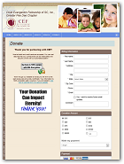
I recently assisted a customer in upgrading their donation page. Take a look!

You will need to add ?ver=2 onto your iframe text.
My old iframe text looks like this:
<iframe src="https://www.trailblz.info/DemoNonProfitMark/Donations.aspx" style="width:500px;height:1200px" width="500px" height="1200px" frameborder="0" scrolling="no" onload="scroll(0,0)" ></iframe>
Here's the ever so minor change needed:
<iframe src="https://www.trailblz.info/DemoNonProfitMark/Donations.aspx?ver=2" style="width:800px;height:1200px" width="800px" height="1200px" frameborder="0" scrolling="no" onload="scroll(0,0)" ></iframe>
The only change is the additional text shown in large letters. The width change to 800 will allow a side by side donation page layout as shown in the screen shot above.
Give support a call to match the coloring on your site. Currently that option is not yet released to our customers.