The query panel has added a number of improvements.
1. We moved some items on the screen.
2. We added some new functions. This document will cover the major changes.
There have been some visual changes to the screen. In other words, we moved some things around. We also added some new functionality.
A word about the new tool strips that have been added.
When you initally open a search panel you will see a tool strips as shown below in red boxes.
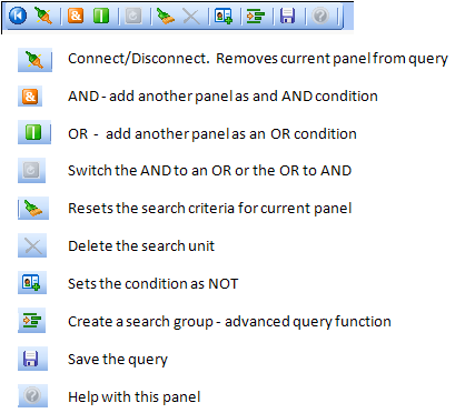
The blue button is known as the More button. When clicked, this will display additional icons.
A brief description of the icons is listed below.
What's been moved around?
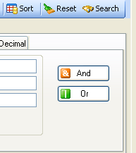
1. The SEARCH button tool strip has been moved to the left of the screen. For anyone with a low screen resolution, there were buttons that were not visible when the SEARCH button tool strip was positioned on the right.
2. The AND/OR buttons have moved from the sides of the panels to a tool strip above each panel. See the section above titled: A word about the new tool strips that have been added.
| |
Version 5.0.xxxx |
Version 6.0.xxxx |
| |
 |
First, expand the tool strip icons displayed:
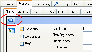
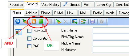
This will reveal the AND/OR buttons:
 |
3. File and Edit used to be part of the menu bar at the top of the screen. The contents of File and Edit would change depending on what panel you were currently viewing. Since the contents of those menu items were changing, we decided to place them on the panels to which they pertained.
| |
Version 5.0.xxxx |
Version 6.0.xxxx |
| |
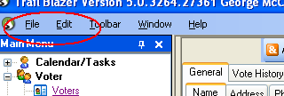 |
 |
4. The "Not" checkboxes have been moved to the tool strip and it's now an icon.
| |
Version 5.0.xxxx |
Version 6.0.xxxx |
| |
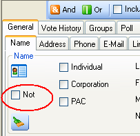 |
First, expand the tool strip icons displayed:

The NOT is now a button:
 |
What new functions have been added?
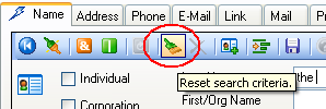
1. You can now reset the search criteria on a single panel. In the past the reset button would clear the entire query. You can still do that if you want, but you can also reset just the panel on which you are currently working.
Be sure you have expanded the tool bar by clicking the More button as circled below. See the section above titled: A word about the new tool strips that have been added.

2. When doing AND/OR queries in version 5.0.xxxx the screen would open a new panel to the right of the existing panel. You now have some options as to how this will look on your screen. By default, the additional AND/OR panels are tabbed. You may also display them side by side (traditional method), and my personal favorite is to view them as over/under.
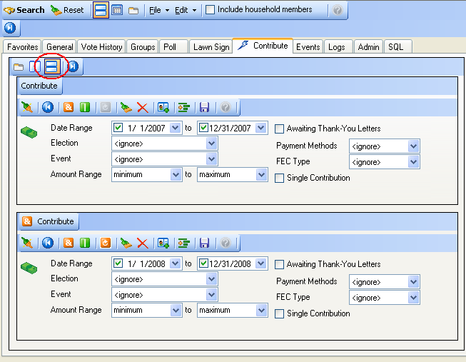
Example: Who contributed in 2007 AND in 2008?
The classic look to this query has the two panels side by side. Note the 2007 criteria on the left panel and the 2008 criteria on the right side panel.

By default in version 6.0.xxxx the search panels are TABBED:
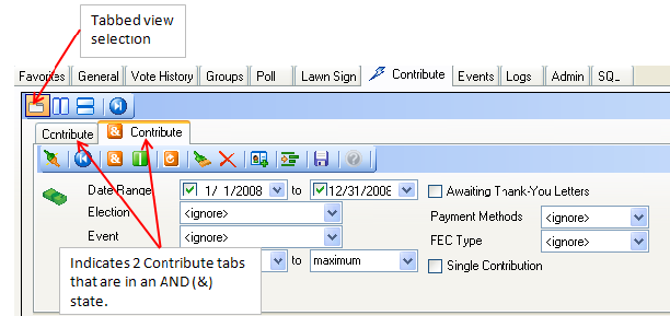
Now my favorite view is the OVER/UNDER (vertical view). Notice how the panel with 2008 information is directly below the panel with 2007. Clicking the OVER/UNDER button will provide this view.
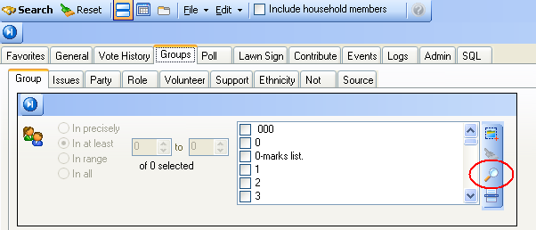
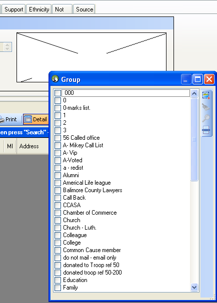
3. Zoom in on the checkboxes. If you have longs lists of items within your group tabs, you can now expand the checkbox to full screen if you like. This will give you a bird's eye view of your list.
Click the magnifying glass to expand the checkbox.
You may adjust the size of this window to your choosing. When you have completed your check box selection, close the box by clicking the X in upper right corner. It will collapse back to the panel from which it came.
4. A lightning bolt lets you quickly see which tabs have search criteria entered. The tabs with lightning bolts on them below indicate some criteria exists on those tabs.
